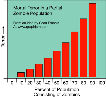
 Okay, the graph is moderately amusing (and I am confident enough in my nerdiness that I can admit to finding most of the graphs on Graphjam moderately amusing) but the relevant point here is the discussion it sparked when posted on BoingBoing.
Yeah, this seems very inaccurate. If we're talking about "total amount of terror," it should go down the more people get zombified. If, as seems more likely, we're talking about the amount of terror in the average non-zombie, it still wouldn't be a smooth curve like that. It would plateau pretty damn early. The difference between 0% and 10% would be a lot bigger than the difference between 10% and 90%. And 100% wouldn't be zero terror, it would just be N/A: there is no more population.
This is directly relevant to SIR models because you can easily get confused if you fail to distinguish between individual and population level parameters. The confusion here is because 'terror' is not defined - is this your individual level of terror (a feature of the number of zombies and their fearsomeness), or the total amount of terror in the population (a feature of the number of zombies and their fearsomness AND the number of unzombified people around to be scared by those zombies).
No comments:
Post a Comment